In the midst of the COVID19 pandemic, my girlfriend and I mastered a carrot cake recipe. As we had found ourselves with a bit more spare time and were confident that this was a great product - we decided to start a small cake operation from our house. Initially selling to neighbours, friends and family - word-of-mouth marketing helped grow our brand into something much larger than we thought it was going to become.
When we supplied a local cafe with our cake for the first time, building a visual identity became imperative as we were looking to build on this early success and needed an online presence to do so.
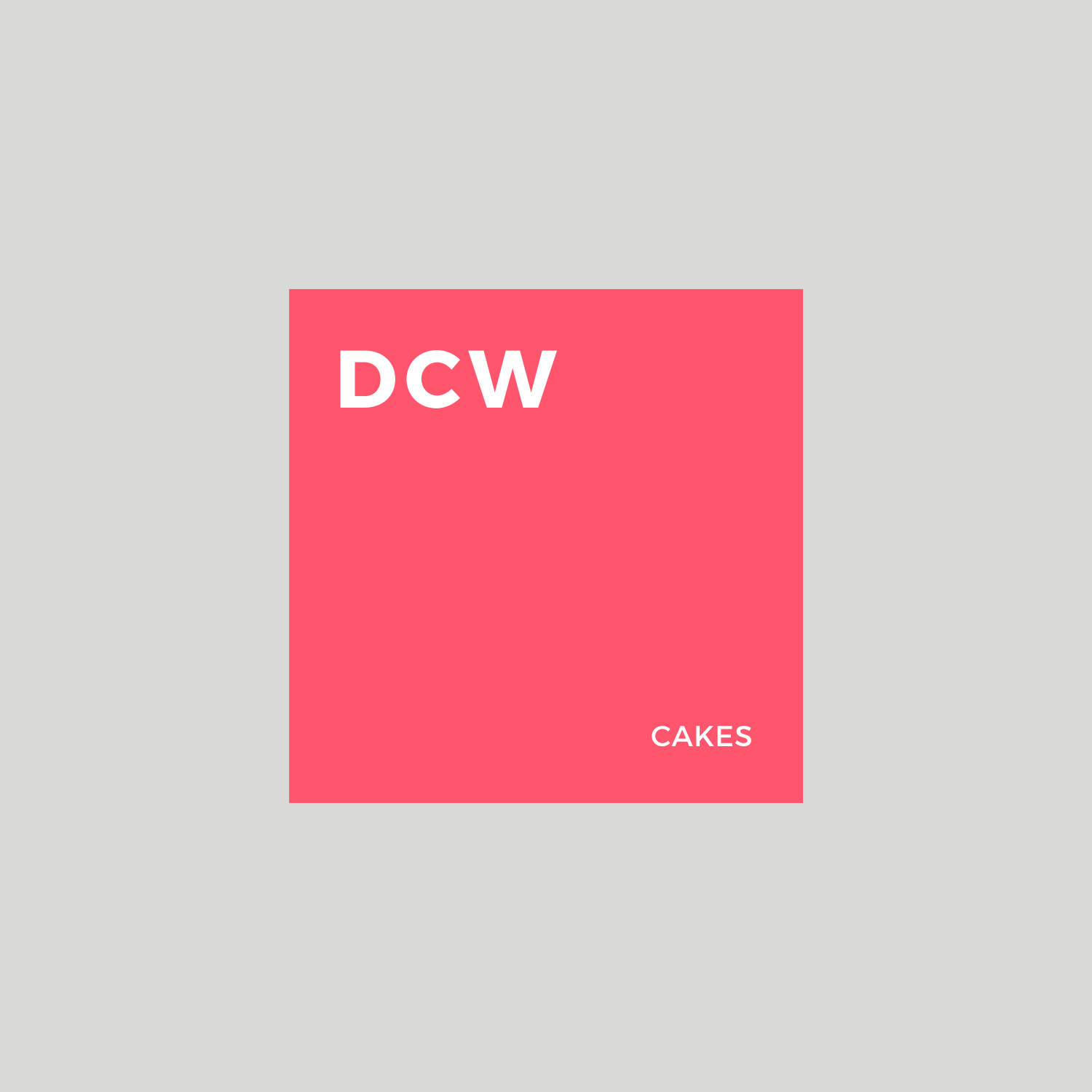
(Diets can wait) aka DCW Cakes was born.

#1

#2
#3
#4
#5
#6
#7

#8
#9
#10
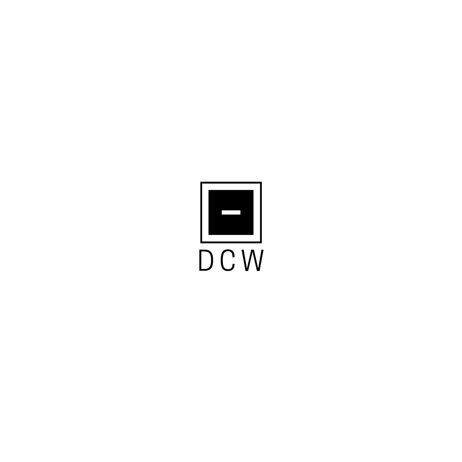
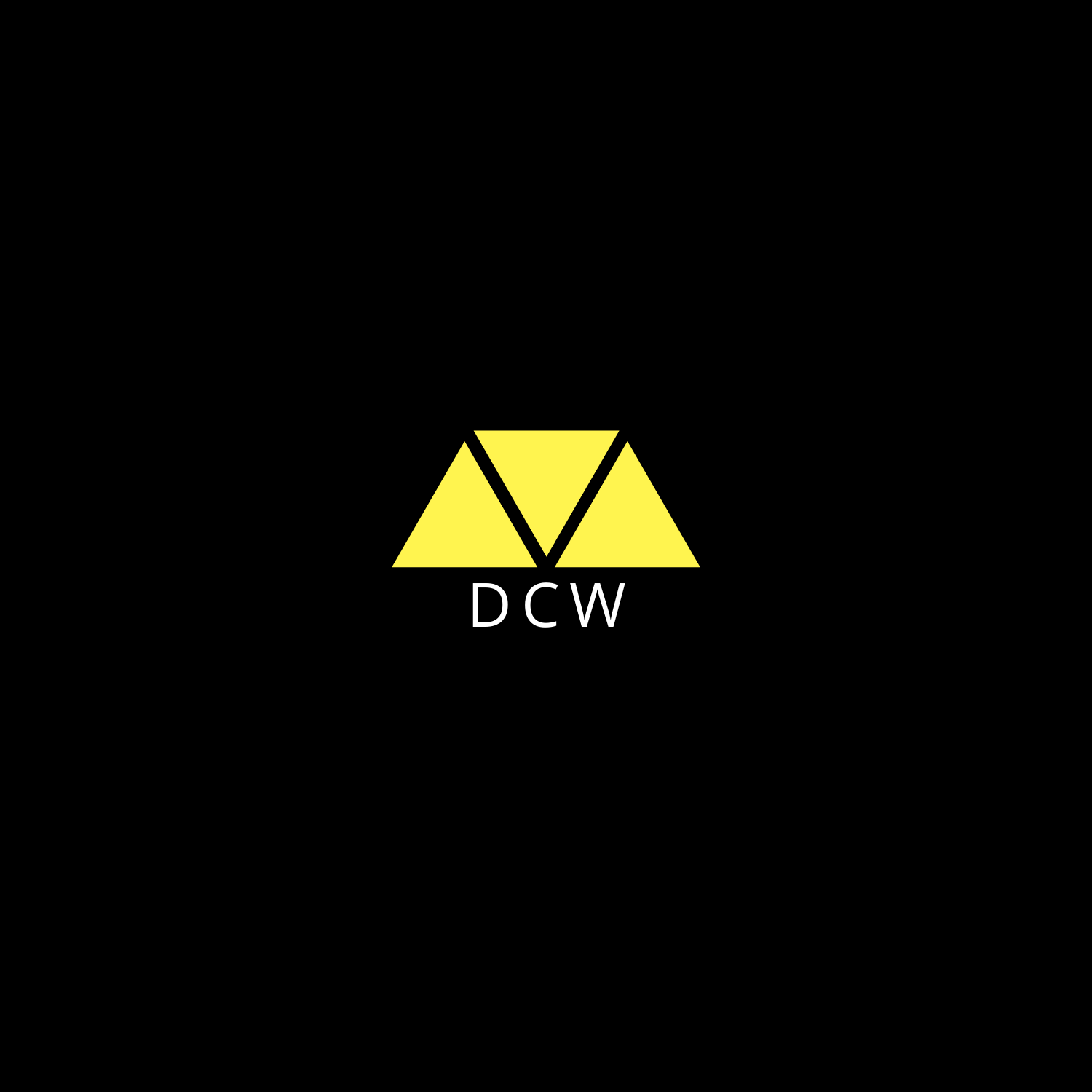
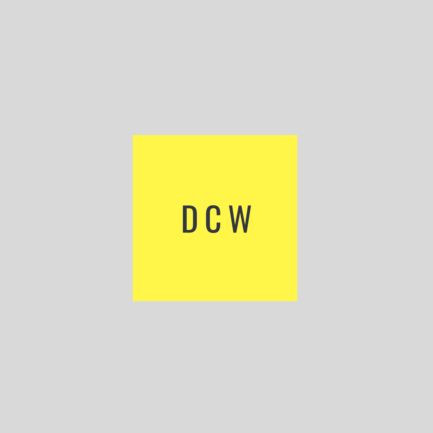
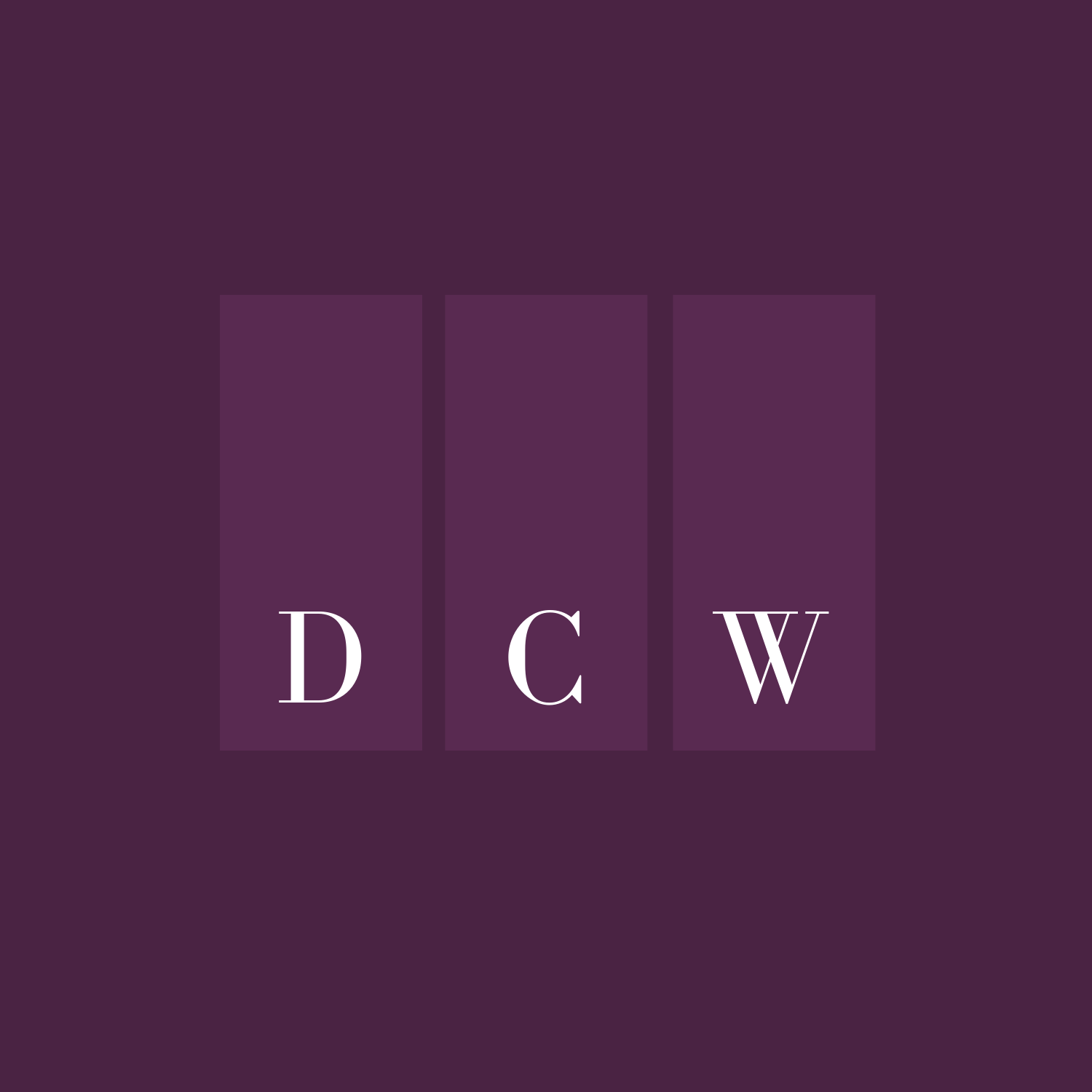
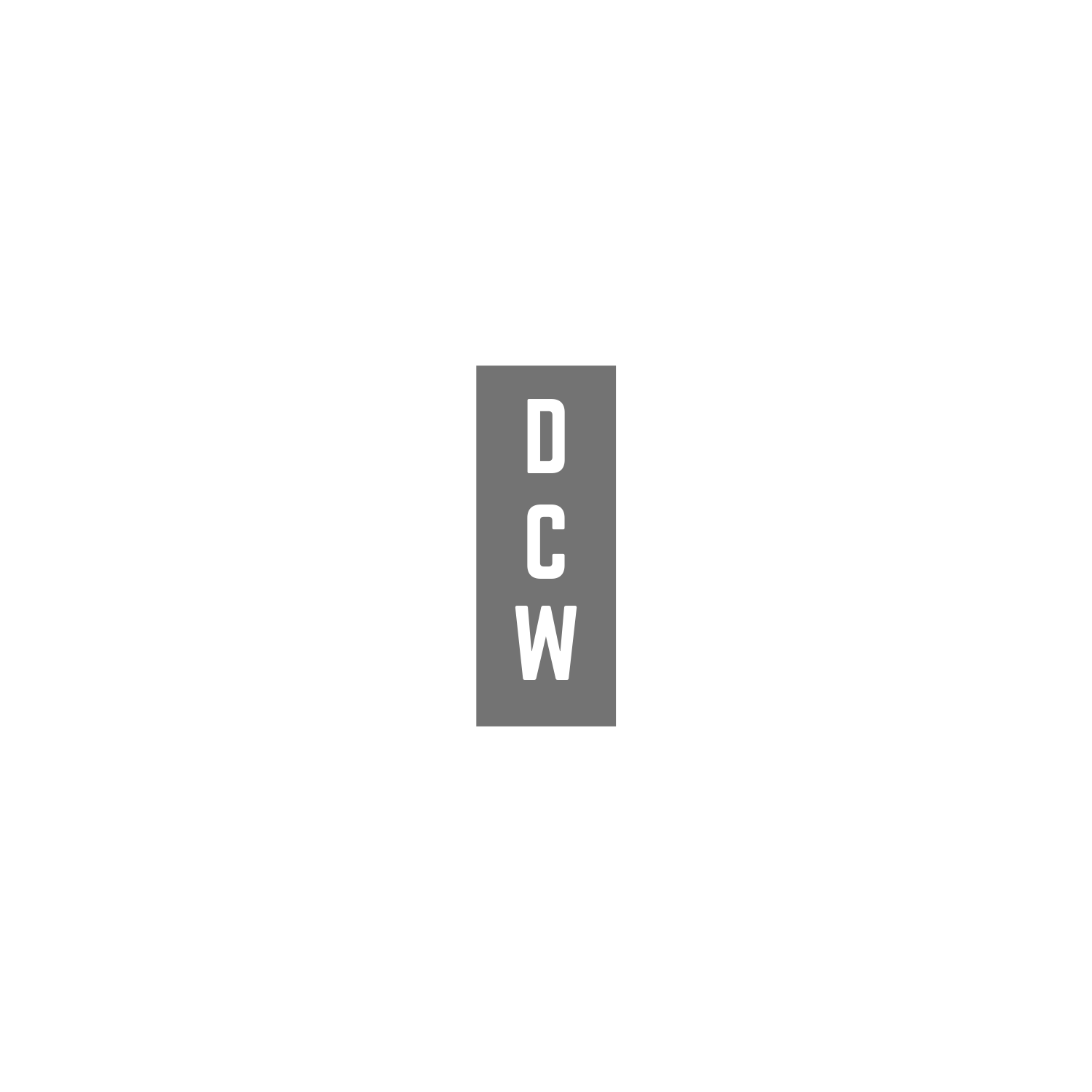
Developing a visual identity started off with logo design - helping us lay the foundation of our brand and the first step in developing our aesthetic. We played around with various ideas; focusing mainly on typography, shape and colour.
The simple white lines and ease of future adaptability in #3, #8 and #10 were early favourites during the initial brainstorm. However, #1 was chosen moving forward as we looked for a warm aesthetic that would match the comfort food that is our cakes.


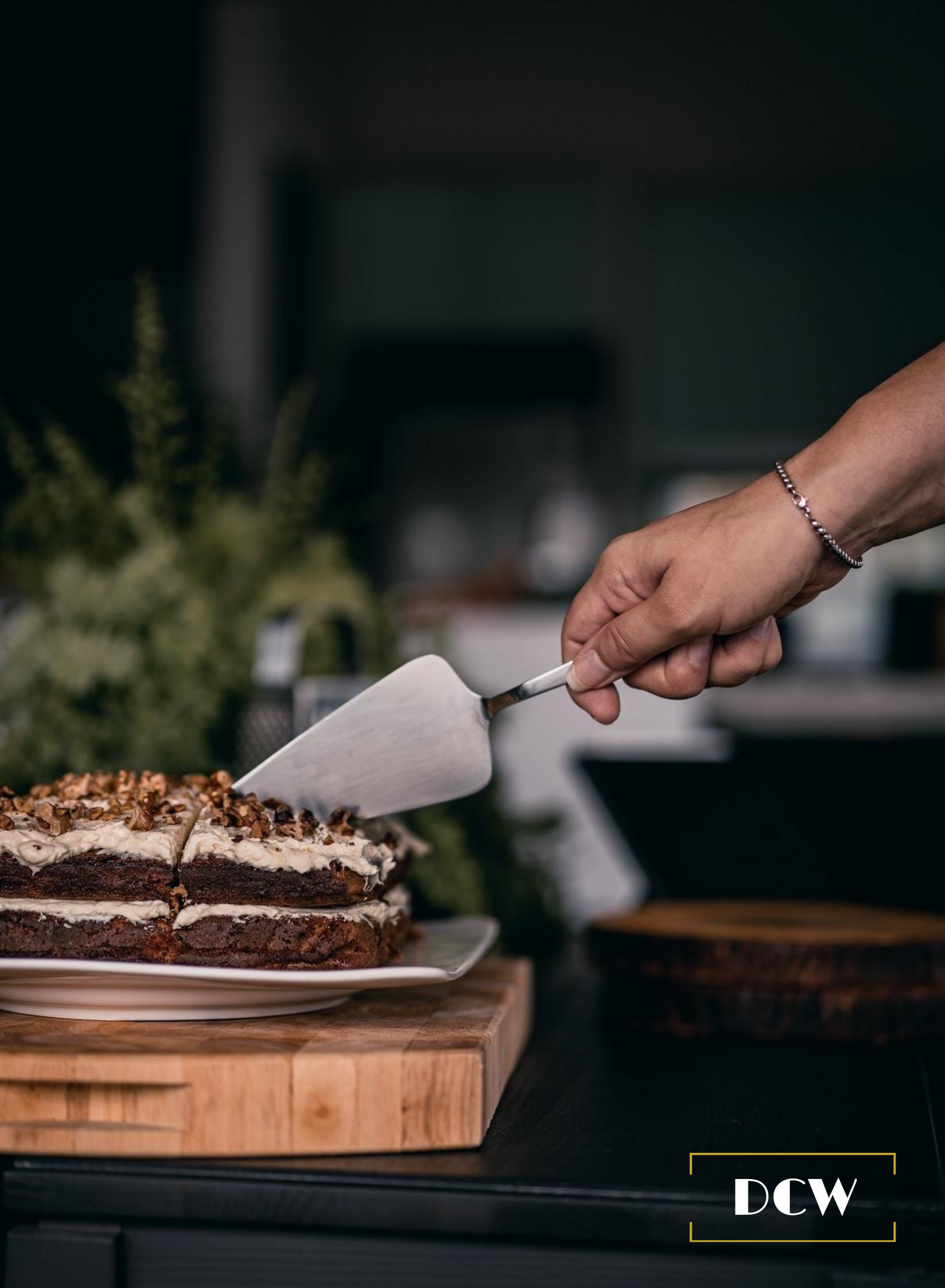
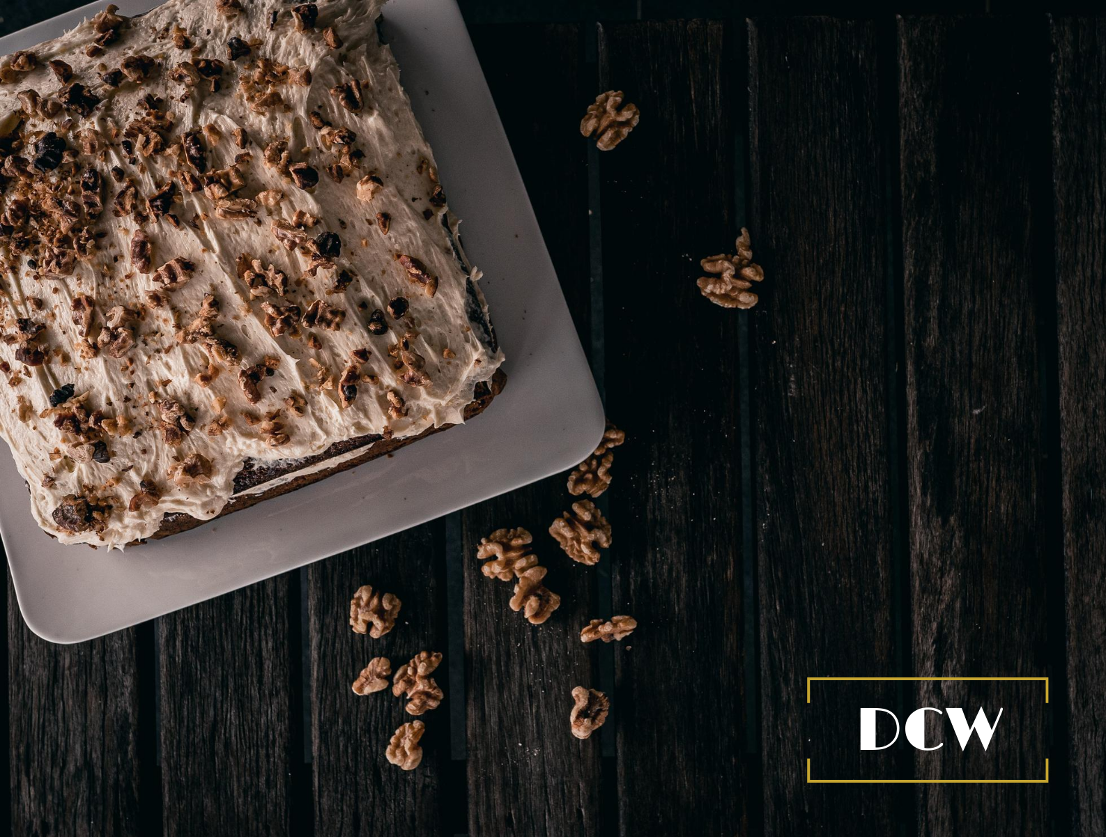
Once we had the logo completed, we worked with a freelance photographer to help take photos of the cake, providing us with some content that would be used on digital channels.
Once we had content for our social feeds, we opted to create highlight images for our IG page where all FAQ information would be stored. Payment terms, price lists, how to order and delivery options then became easily accessible once a potential customer visited our feed.